Animal prints are seen everywhere nowadays but the history of animal prints started during the ancient days of cavemen. Early humans skinned their prey and wore the furs and pelts for warmth and protection. These skins were thought to bring strength and power to the human who wore them. The animal skins were mostly worn by hunters or pharaohs, kings, and rulers over centuries. Animal prints have been a popular accessory through the years and today we're exploring the reasons why their popularity has spanned different cultures and decades.
In the Tibetan culture, motifs in art and textiles show tigers migrating from the south, meaning from India. Tigers embody power and a balanced mind and are usually depicted as alive or as a full tiger skin. The origin of Tibetan tiger rugs go as far back as Tibetan carpet making itself. These tiger rugs were used as meditation mats, and it is believed that the tiger provides that person with protection while they meditate. They were also used as a status symbol for Tibetan or Mongolian high officials who were usually pictured sitting atop rugs like these. Carpets with traditional tiger stripe motifs can be seen at ritual dance performances of Tibetan festivities.


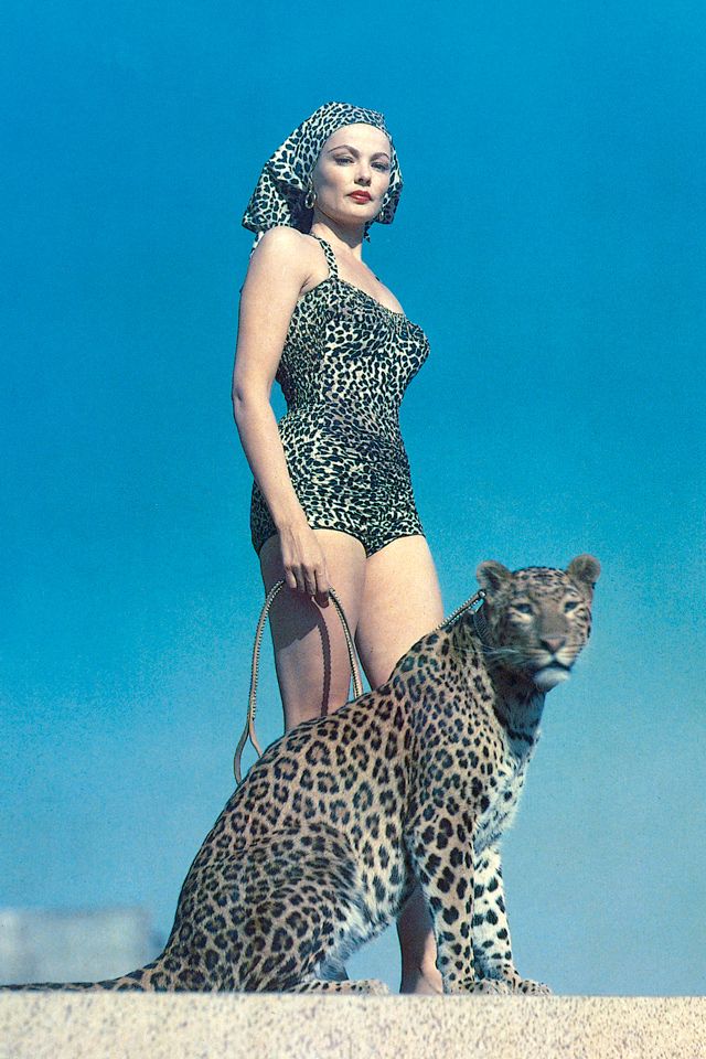
Over time, animal prints and their beautiful and bold design elements naturally translated into the fashion world and since the eighteenth century we've seen these prints in clothing and accessories. Through the years a stereotype also developed that when wearing these prints a person gives off a statement of confidence, a "center of attention" aura, and a certain sexual appeal - a "wild thing" so to speak. Even in today's fashion world, wearing animal prints represents an independence of spirit and wild-child sensibility. Christian Dior was one of the first designers to introduce the leopard print into a wearable dress instead of just an accent piece or actual fur. If you're going to wear leopard, why not all over?


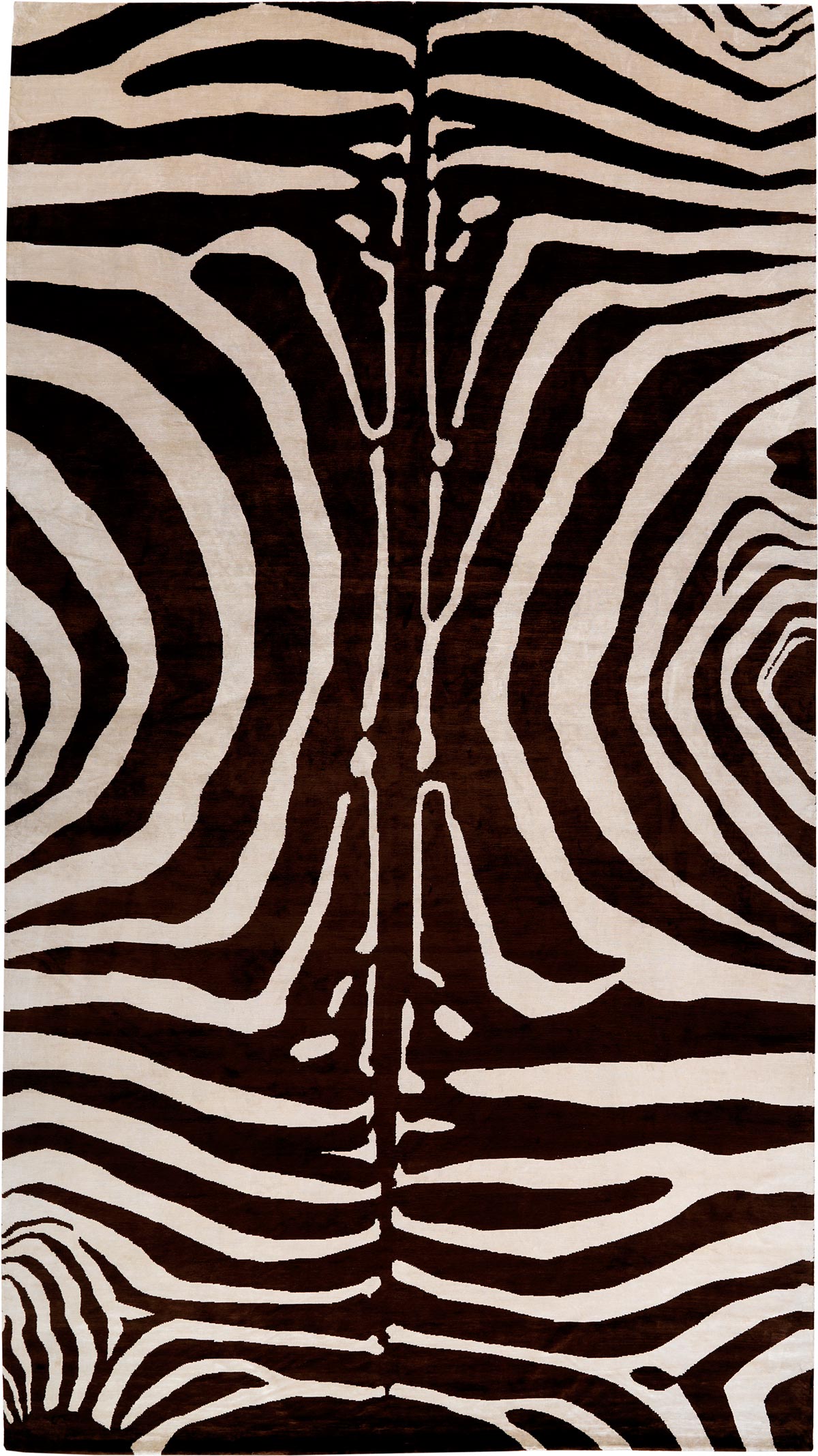
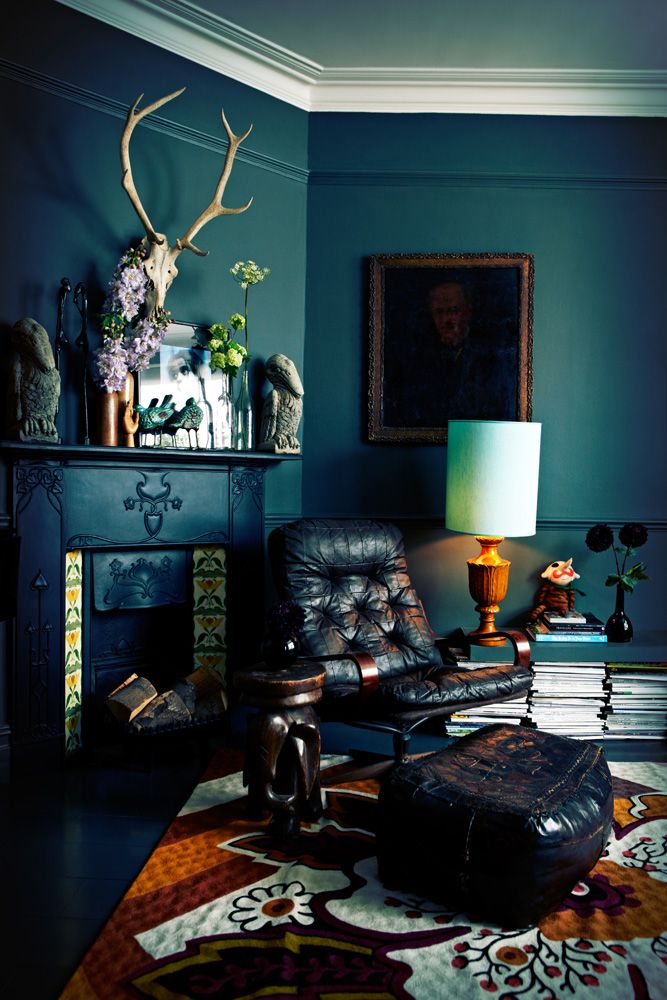
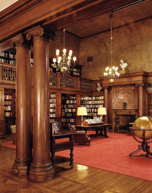
In the same way that animal prints in clothing show a boldness of spirit, so does an animal print in your home. From the earliest days of bear and tiger skin rugs on the floors of caves, castles, and fortresses, pelts and animal prints have translated into the realm of modern day interior design as well. Animal prints in home interiors can be versatile or add an edgy, exotic element. If they are overused or mixed inappropriately then can turn dated and gaudy. One way to introduce an animal print into a space is to start with the rug. Rugs form the foundation of a space and you can choose to go with a literal color way - black and white zebra, orange tiger, classic leopard pattern - or with something more abstract, like a bright pink Zebra design. If you want to incorporate the animal print but with a subtle flair, choose a rug that is tone on tone. Even in a toned down palette, animal prints give a stylish flair and leave their mark.


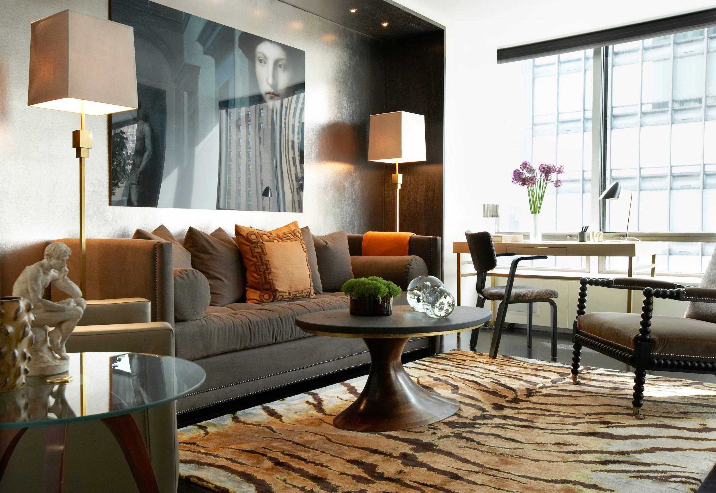
Carini Lang's Tiger Caramel carpet shown in an interior designed by David Scott