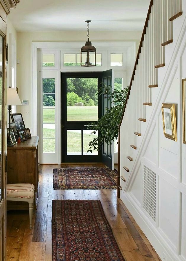
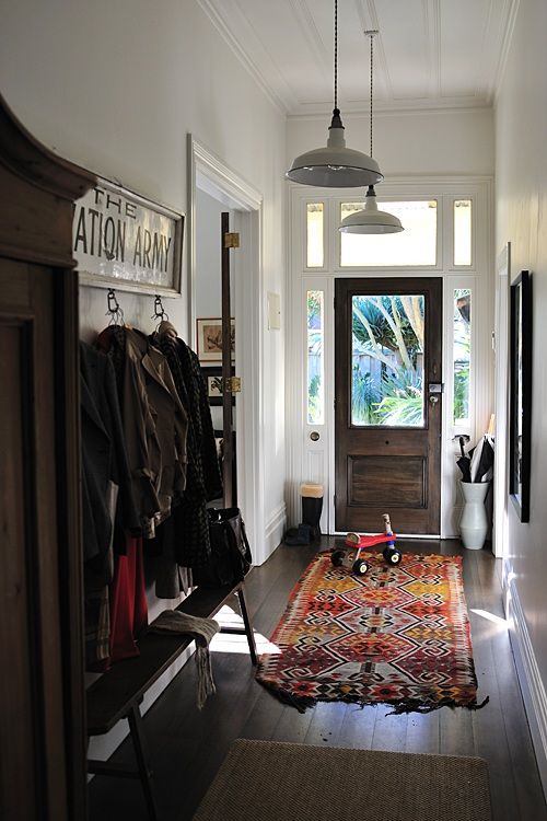
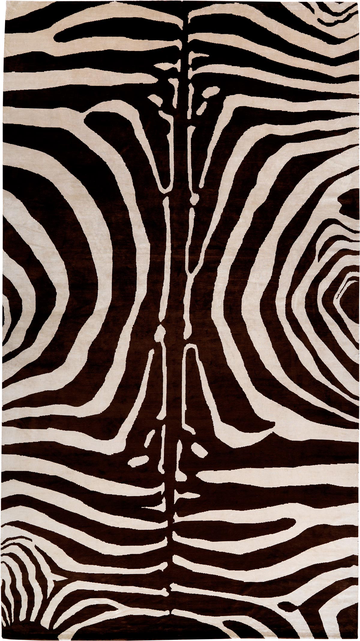
Many of our customers associate nettle with hemp or jute, and although they're similar, nettle has certain characteristics that set it apart. Hemp and nettle are both food, fiber, and medicinal plants used throughout the world. Nettle is an English name used for the type of plants that have stinging hairs. Himalayan nettle, the type of nettle that we use here at Carini Lang for our carpets, grows wild in fertile forest soils in altitudes ranging from 3900 to 9800 feet in the Himalayas. The fiber is extracted from the stem of the plant and is stripped until the fiber is extracted. We choose to weave nettle here at Carini Lang because it is a beautiful material that offers durability, texture, color variation and creates a spectacular silky luster.

The whole plant is filled with beneficial elements - the root, stem, leaves, and the flowers. In ancient Greek times, the stinging nettle was used mainly as a diuretic and laxative. In ancient Egypt, reports are found of nettle infusion for the relief of arthritis and lumbago pains. Today the plant is still used for these common ailments and several other illnesses including diabetes, and as blood purifiers. Drinking nettle tea is a common way of ingesting it's various medicinal benefits. Nettle was also used for everyday practical purposes such as durable rope and fishing nets for Europeans and Native Americans.
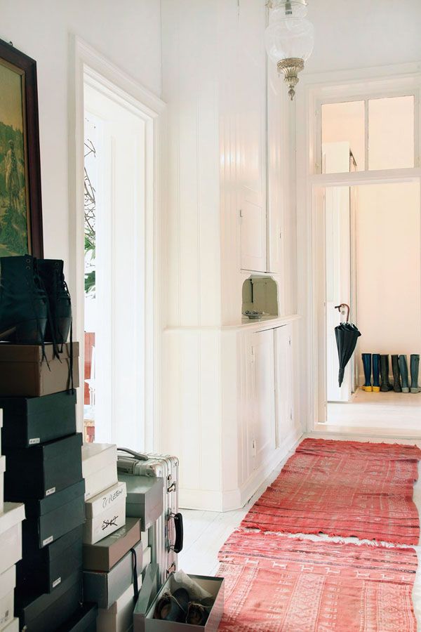
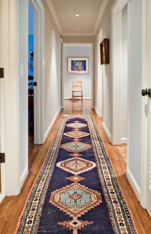
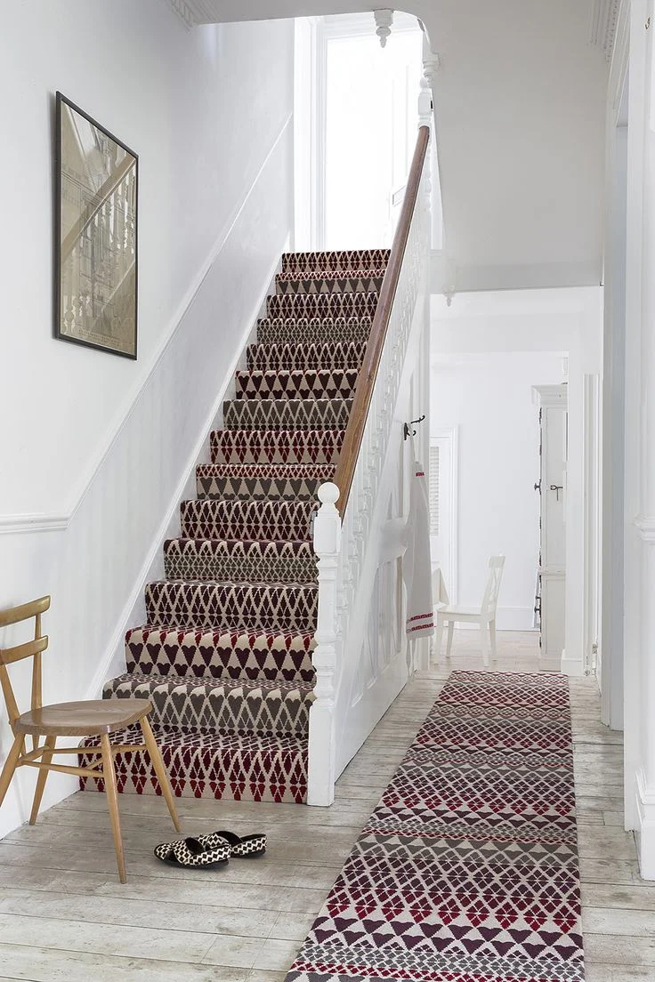
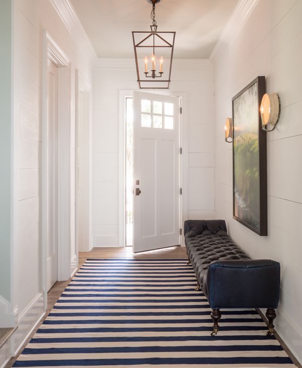
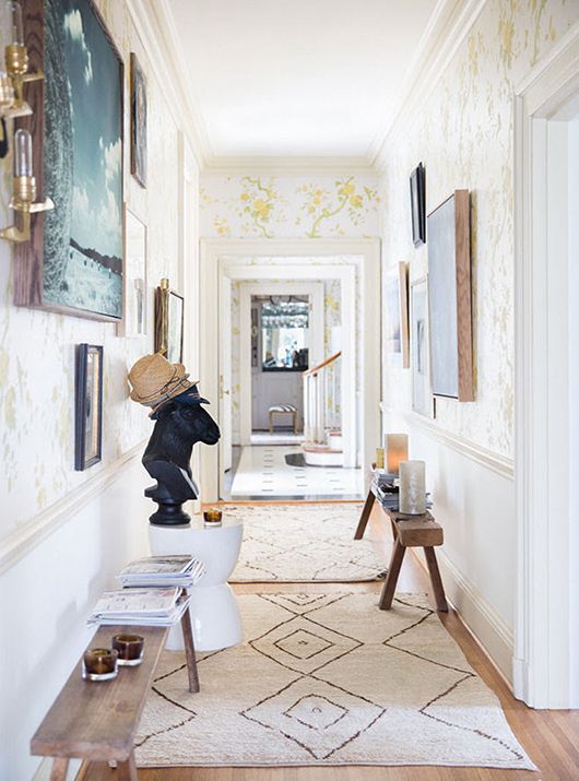
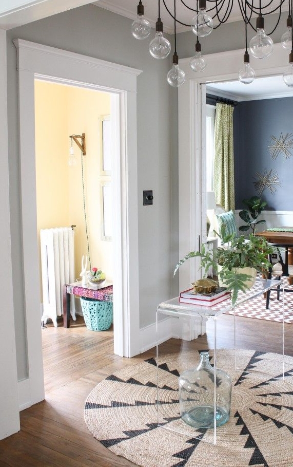
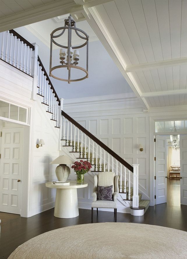
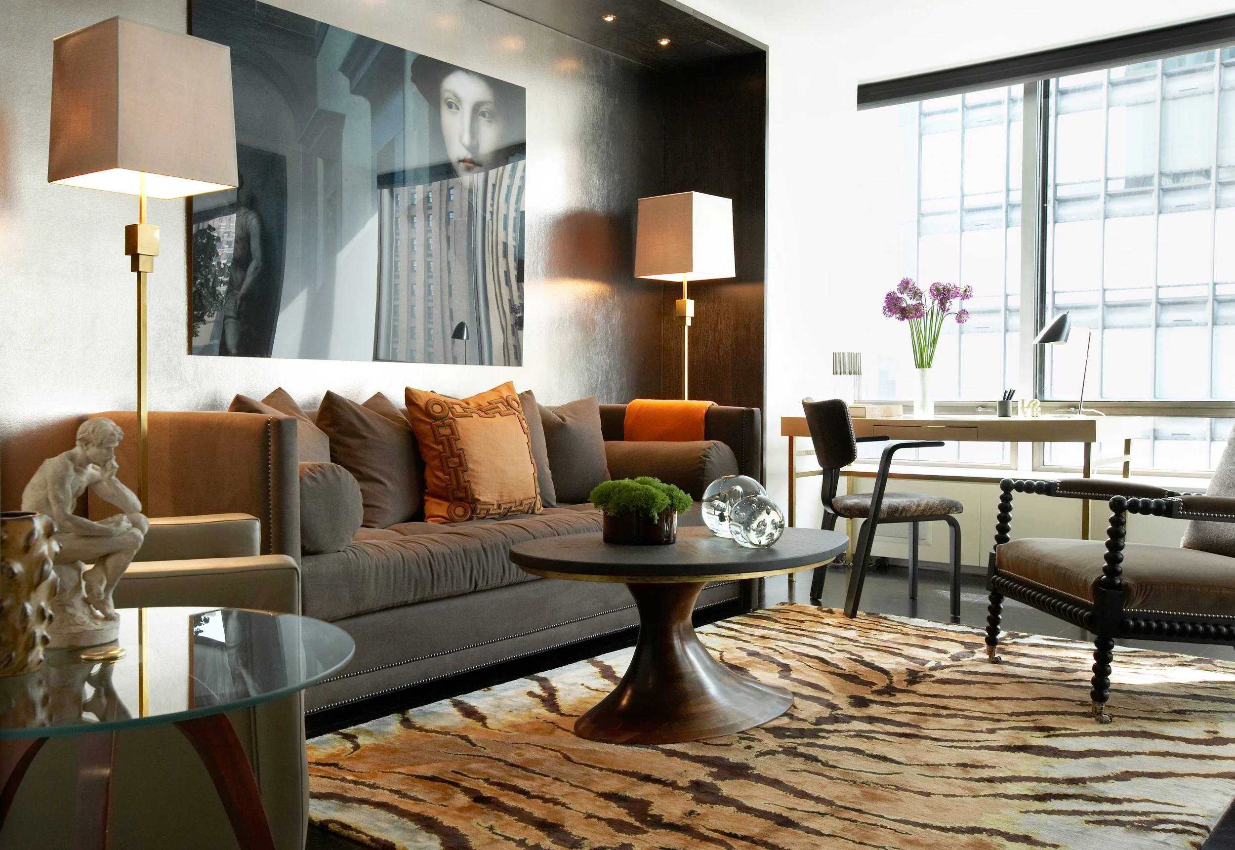
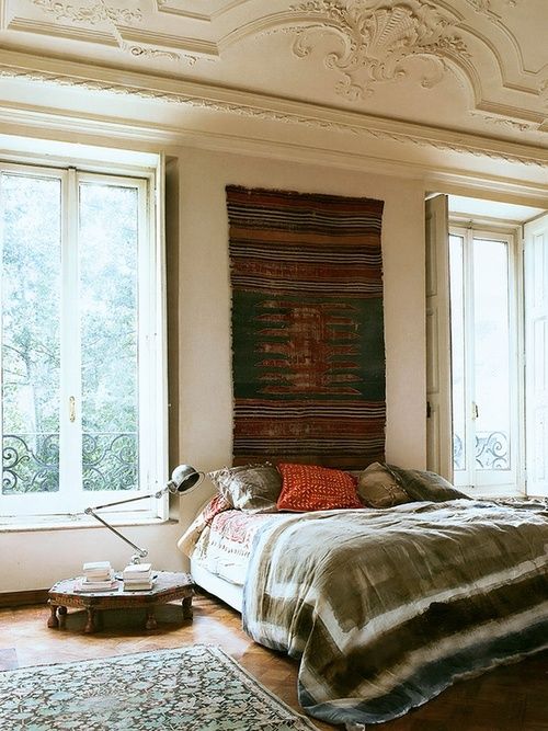
Nettle fibers have been woven for centuries, and were the popular choice for clothing before the production of cotton. The fibers of the stinging nettle plant are hollow which means they can accumulate air inside creating a natural insulation. Nettle is a soft, light weight fiber which is what creates its silky luster. These qualities make them perfect for carpets, and bring a different texture and look to your interior. With our nettle carpets we dye the yarn in batches which gives the carpet a great color variation and abrash. Here at Carini Lang we process our nettle without any pesticides or chemical dying and we prefer to dye our carpets with vegetable dye. The beautiful color variation of natural un-dyed nettle is even so appealing that we often use no dye at all and let the mix of unaltered nettle color variations shine through on their own!


Nettle with border

Nettle with fringe
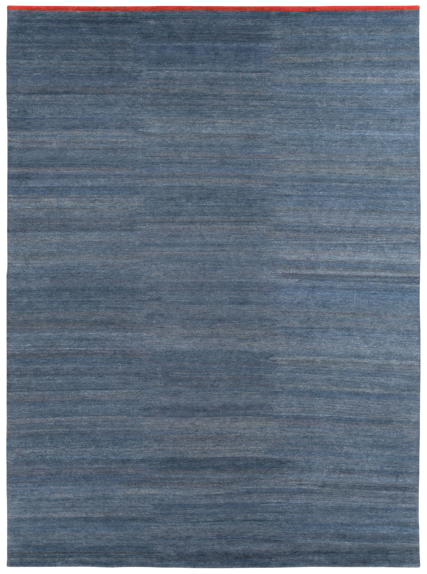
Indigo Nettle with border

Interlocking circles in Nettle